NETWORK PLUS
— Brand Identity
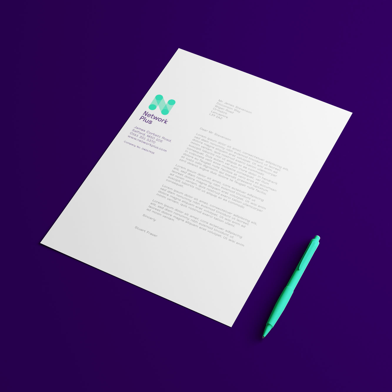
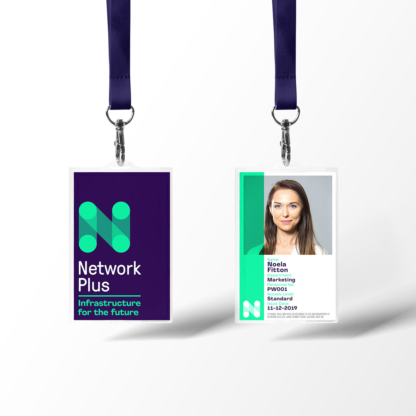
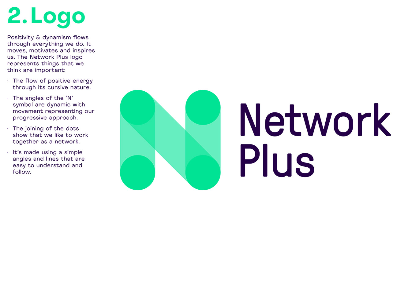
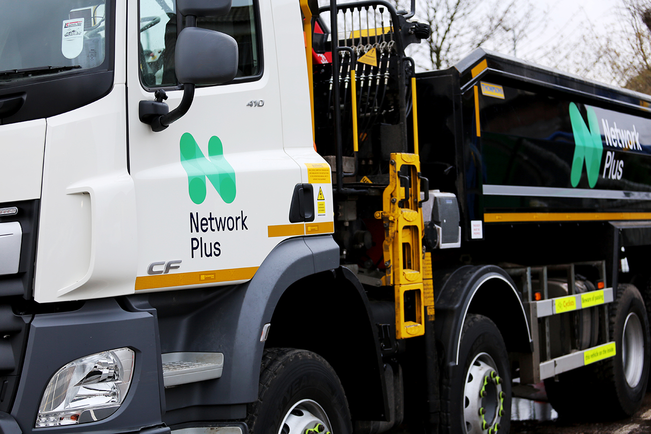
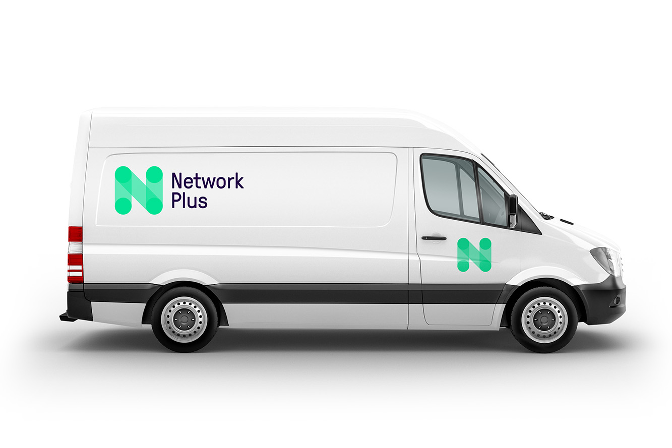
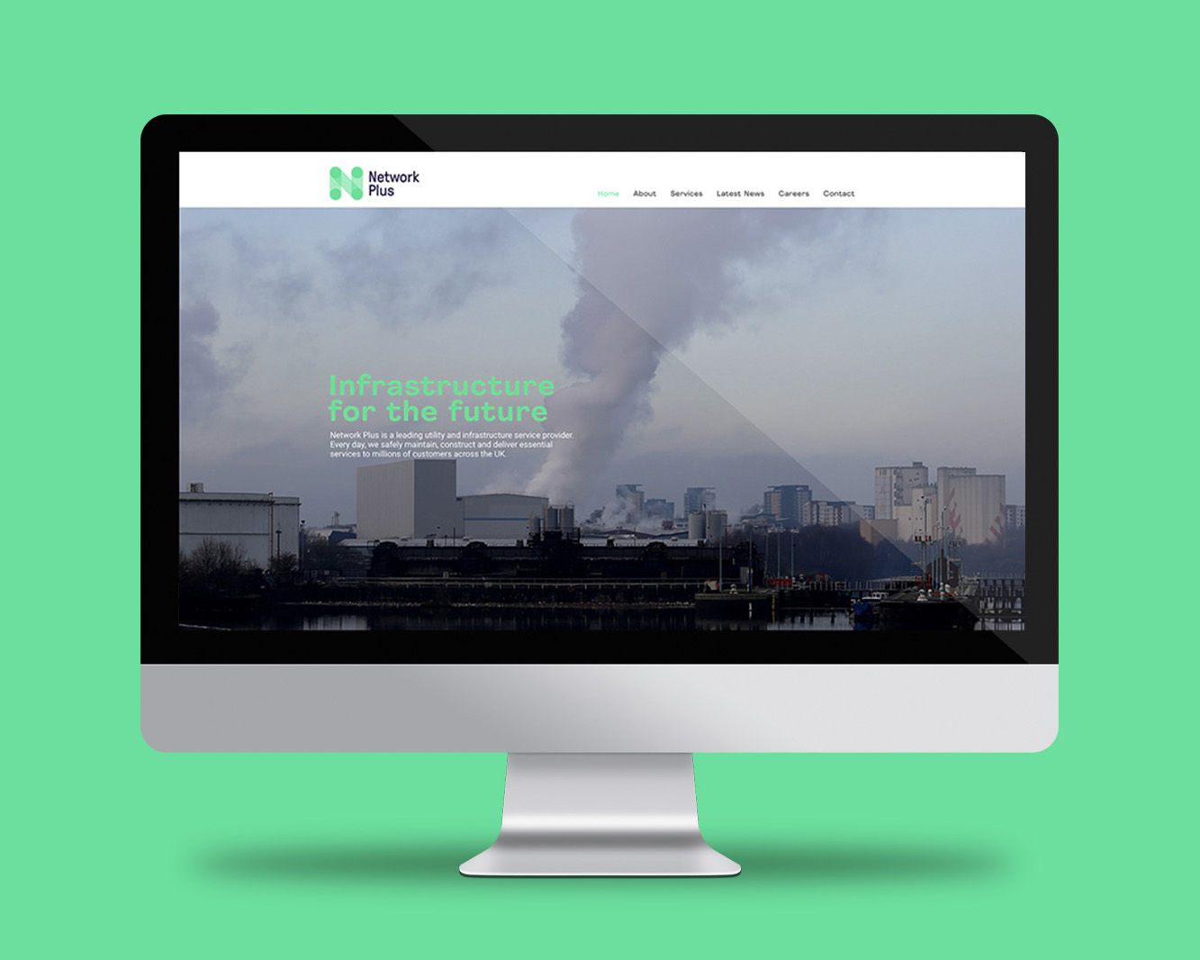
The Network Plus branding was created to reflect the companies growth in experience & excellence in the utilities maintenance market.
The new identity is both dynamic and modern, and most importantly shows how well and with ease they connect with their clients.
The N icon represents the flow of positive energy through its cursive nature. With the joining of the dots showing that they work together as a network.
Client — Network Plus